This was an earlier piece that I’m including in this new group of essays on “problem kids” at the role playing game table:

We’ve all had some version this guy/gal in our groups. They get their moment in the spotlight during the session and just don’t seem to be able to let it go. Maybe they’re someone that every day is a “me day.” Maybe they don’t get to play often and just get overly-enthusiastic. Maybe they GM much of the time and are used to being the center of the group. (cough me cough) Maybe they’re the wannabe actor/tress for whom attention is the thing, more than the play. Maybe they just talk…a lot. (You can tell what spurred this post, can’t you?)

So how do you shut down the spotlight hog without hurting their feelings, being to obvious about it, or being a jerk? If you tend to be a hands-off GM, it’s going to be harder to move the action along than if you are a bit more active. For me, as a narative-type who likes to be involved more with the play than a simple “What do you do?” sort of GM, it’s a matter of engaging the player first, then shifting the focus of of them in a way that feels natural.

Example: The GIQ is doing a bit of expounding on the legal complexities of the adventure or mission the characters are on. It should be a simple bit of exposition, but the player (as well as the character) is a lawyer. And a bit long winded. Okay, knock off the “a bit”. He’s been on a roll for about five minutes, already, and has missed the queues from one of the other players — the equivalent of “Read you. Press on.” In the interest of advancing the plot and letting other characters get a bit of “scene time”, it’s time to step in as a GM.

At this point, I engage the player sort of like a director talking to an actor. Get into his mind space, or his emotional state with a few pointed questions. I’ve got his attention now. I shift the attention to the character he was talking about — how do you feel about this? What’s your perception of the information? Now the attention is on the other player and I can get the other players back in.

Now, I’ve found that 9 times out of 10, you’ve just fixed the problem. But sometimes GIQ is not going to want to relinquish the spotlight so easily. If you have successfully moved the attention — even for a moment — a simple upraised finger  (a “wait” finger) should do to keep that player sidelined long enough for the other players to get their say in for the scene, then return the spotlight to the player, or move on.

This is the gentle way to use social judo to take control of your game when necessary without coming off as a jerk.

Any other techniques out there?

There’s a great schtick in an awful (but funny) movie called Brainsmasher: A Love Story: the lead character’s mother seems to always be able to reach him by phone, wherever he is. Standing next to a pay phone? Mom calls. The villains are torturing him, and the lead bad’s cell phone rings… “It’s you mother!” “Gimme the phone. No, Ma, I don’t know when I’ll be home! Hang up on her.”

In a lot of RPGs, players often exit in a vacuum, much like character in movies — they are sprung fully-armed and armored from the Players’ Handbook, ready for action. No friends, no family, no real background. they develop in media res, and are a product of the numbers on a sheet and the adventures they work through. In a fantasy campaign, you can Conan the hell out of your background — the warrior/mage/rogue that has lost their family, or they simply don’t impact their lives — but in other sorts of games, building in family and friends for the characters at the start can really help flesh out a game.  

I’ve written a few times on how adding friends and family and playing a “season” before the Cylon attacks in our Battlestar Galactica campaign really helps the players experience their characters’ loss, but this isn’t the first time that family has been important in our campaigns. Often in espionage campaigns I’ve run the family is an important part of the character’s backstory. They’re the people you want to get back to (or escape the chaos of young child, as a former special forces guy I know admitted.) They don’t like when you’re out adventuring; they want you home. The issues of family and spies have been well done in True Lies  and more recently, TV’s Chuck

Family make decent motivators for adventuring, as well — family make great McGuffins: The terrorists have your daughter! The alien menace is advancing on the hiding spot in which you left your family! Your best friend discovered a hidden city in the Amazon! You son just knocked up his girlfriend and you’re way too young to be a grandfather! All of these can be seeds for an adventure.

But the best use of family is as, what they call in television, the “B plot.” Something is going on in your private life that needs your attention, and which distracts from the “A plot” (the adventure). Perhaps there’s an issue with your kid or wife that needs your attention — the wife was in a car accident and is injured and at the hospital — this murder investigation is just going to have to wait for a bit. Or you keep missing that parent-teacher meeting because you’ve been fighting creeping tentacled evil that is trying to break into this world…not exactly something you can tell them, but if you don’t get your ass over to the school right now, they’re going to think you are a negligent parent.

Beyond all that, even if you’ve just got the characters getting the occasional phone call or letter from their parents, having connections to the world around them outside of the plotlines gives a sense of reality to the world, no matter how fantastical it might be.

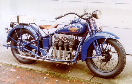
In 1929, Henderson Motorcycles released their “Streamline” bike — a powerful 1300cc four cylinder machine that allowed the bike to break the 100mph barrier. The KJ Streamline would become popular with police forces for its forgiving nature — as they could run from 8 to 100mph in top gear with no issues. The torque was impressive, allowing them to accelerate and decelerate swiftly. Not content with building one of the most powerful bikes of the time, Hnderson released a “Special” for $30 more with higher compression pistons and a larger carburetor that boosted the machine to 45hp and which hit 116mph on one run.

Henderson-1930

Henderson KJ Streamline Size: 1   Def: 6   Str: 6   Spd: 100   Han: +2   Crew: 1   Pass: 0   Cost: $450

Henderson KL Special: Size: 1   Def: 6   Str: 6   Spd: 110   Han: +2   Crew: 1   Pass: 0   Cost: $480

And the one that really caught the eye…

The 1934 Henderson KJ Streamline 

streamliner_1280

streamliner4_1024

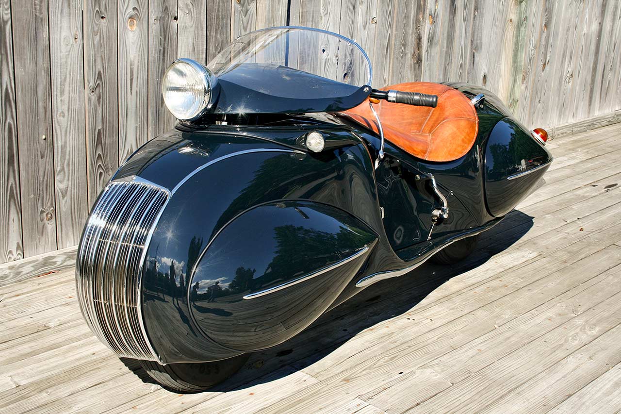
This concept Streamline that came out of the impending Excelsior-Henderson merger could have been called the first scooter: it rode on 10″ wheels, had a fully-encased chassis, and a different seating position that was uncomfortable for the tall rider. The bike was heavy, a bit unwieldy in turns, and a pain in the ass to maintain:

1934 Henderson KJ Streamline: Size: 1   Def: 6   Str: 7   Spd: 80   Han: 0   Crew: 1   Pass: 0   Cost: $600

This one, however, has the most potential for pulpy goodness — of course a masked do-gooder could ride this with a boatload of style…yet no one would put together he’s on one of a handful of these things made. Cops in the 1930s just don’t put that sort of thing together. Or heavily modified, it would be the perfect platform for a “rocket cycle”…if only to do your best Brian Blessed “Flying blind on a rocket cycle!?!”

It’s a space sorta day here at the Black Campbell. Here’s the link to Issaac Campbell’s original site for graphic, which deals with marketing aspect of the infographic:

spacex-falcon-9-rocket_527a78812b95c_w1500

Andrey Klimov did this entire project on his lonesome…

So, we’ve had a couple of good episodes running over the past few months in our Battlestar Galactica campaign that have centered on the emerging politics of the fleet. Unlike the show, where the government just sort of materialized as if by magic, or fleet has been hampered by the logistics of moving people and goods between, essentially, 78 islands in space. There’s a black market that has fired up almost immediately. There’s hoarding and other problems just trying to get a handle on what they have in the way of resources, how many people they have (still an estimate, but a pretty good one), and how to motivate people to work where needed.

The fleet immediately went on half rations for the civilians not working, 2/3rds rations for those working in essential areas (military, bioship, repair ships, etc.) and they’ve been trying to recruit people for the Fleet and marines. Of course, with no place to really do physical training and no time for basic training type stuff, the newbies are being thrown straight into OJT. Pilot trainees are learning their OCS manuals while at the same time trying to learn basic flight. Enlisted are right into occupational training. The marines are about the only people they have the time to train with weapons.

They are also putting together a Marshal Service to police the fleet for violent crimes — murder, assault, rape, human slaving (which they’ve already run across), hunt Cylon infiltrators, and hoarding (although there’s a question as to where property rights end…can they just take people’s things? What does that do for motivation?)

One of the B plots is finding resources to replenish the fleet. A raptor went missing this week’s game (Halloween night) and two of the characters had to go on a search & rescue to find them. The raptor had been investigating a system with two giant water worlds, and they quickly found the raptor on the ocean’s surface, riding a mat of algae, and afloat but sinking slowly and in the path of a massive hurricane. They had maybe two hours to effect a rescue. The ship was not answering, so they head down and find the bird has it’s side hatch open. Why? The crew are not answering and there appears no one is aboard. Why not?

One of the characters is winched down under the hovering raptor and boards to find the craft dead. A quick search turned up the seat covers, rubber gaskets, pages from the manuals, etc. …all gone. The character managed to work out these were all organic components and that’s when her pilot realized that the algae mat was moving — crawling onto the raptor. There were a few tense moments where the pilot investigating barely got out of the craft before monster ate her, and some of the slop was eating through her flight suit boot. (She managed to get it off in time.)

The players had been expecting a Cylon plot, or some kind of maintenance issue, so the introduction of their first confirmed multi-cellular life form — and a vicious one at that — made for a sharp turn from the show’s universe. But it also played well into how to introduce a bit of the haunting holiday into an established game.

Yes, I’ll admit right off the bat: I’m a Microsoft Office hater. Their software is bloated, the interface a brick-to-the-face ugly, and the menus make no damned sense. I was a WordPerfect guy — it was the best word processor out there through to the early 2000s. When I bought an iPad, I found I truly loved the simplicity and surprisingly functionality of the “lightweight” Pages and Keynote apps, enough so that when my wife bought me a MacBook Air, i started using Pages and Keynote on the laptop, even though I’d have to sacrifice the clean fonts and layout when I had to shift the presentations over to Powerpoint (but that’s what we use at work…the cri de coeur of everyone sick of the MS Office suite.)

Pages, however, was a dream to create documents in. Especially for e-publication. ePub is the easiest of the ebook formats and everything looks like it’s supposed to when you go the publish a book (then Amazon makes you go to .mobi, which is like can spray-painting a Ferrari.) So I was kind of excited when the new iWork suite dropped on the iPad. Again, for basic work, it’s surprisingly good — easy to use, there’s a lot of template designs and other things you can use quickly, but it’s not for heavy duty work.

Liking what i saw on the iPad, I upgraded to Pages 5 (I haven’t even touched the other apps, other than to test how quickly they opened)…and I am disappointed I may have to work with Word for a while, assuming that Apple bothers to fix the disaster of Final Cut X proportions that it has foisted on its users. But hey! It’s free!

Doesn’t matter when it’s crap. Here’s a thread on the Apple Support Communities to give you an idea of how big a steaming pile Pages 5 is for the hardcore writer or publisher.

First the good (and there is a lot for the casual word processor user.): The big one — collaborations — now you can work on documents with others using iCloud. I don’t do this, and I don’t like sending my personal IP to someone else’s server if i can avoid it. You can track changes, and it works fine with Word docs that are imported. There’s also support for right to left script (Arabic, Hebrew, and the like…)

It still lets you export your work in various formats, you can still email a document right off, although there was a lot of bitching about this on the thread highlighted above — you “send a copy.” It’s no different from the last iteration, really. I did notice it zips some of the documents, depending on their size. It shouldn’t be necessary and might be a developer artifact that hasn’t been fixed.

It looks nice. I want to be able, however, to create a new button toolbar that suits my particular needs and which speed productivity. That was, perhaps, the single best element of WordPerfect; you could customize the toolbars so that you never needed to use the menu, and it wasn’t crowded or confusing. Apple and Microsoft could learn a thing on interface design from the old girl. The “Inspector” — essentially a condensed window of the most necessary control features is something a lot of people are lamenting is gone.

It’s not. they’ve just moved it to a sidebar on the right of your window and called it “setup” and “format”, much like in the iOS version. I like it. I can key it on and off fast, if I don’t want to leave it open.

Templates: there’s a bunch and they appeal to the casual user…and that’s a problem. It’s a pain in the ass now to create a template or import one. Setting up Styles has never been a great feature on Pages and it’s worse than before. but if you just need a canned newsletter, letter, resume, etc. — Pages 5 has probably got most student or non-publishing types covered. (And honestly, I think the market demographic they were shooting for was the student with the free pricing and the ease of use.)

However, that ease of use disappears the instant you want to do complex documents, or ones that can be quickly and easily reconfigured (like, for instance, a brochure where you want to move a single page of text and imagery around fast.) It used to be you could simply click and drag on a section and move it. That’s gone. so it selecting it to get rid of it or to copy it to another document…no, now you have to select in the document, cut and paste. It’s doable, but it’s more time consuming and a friggin’ hassle. No ability to duplicate or delete pages. (This is the most egregious of the idiot moments the Pages development team had here…did they not have one writer or publishing type in the team? If not, I suggest maybe having a user of your bloody product to review it might be in order.)

Worse, layout breaks, and the ability to do multiple layouts? Gone. Layout margin changes? Gone. Merge fields? Gone. Importing Numbers (their spreadsheet) into a document? Gone. Two page view seems to be gone. Find and replace special characters (like extra character returns so Amazon’s execrable .mobi doesn’t take a crap when you try to publish a manuscript)…gone. Bullet points in comments. Gone. Importing images not in bloody iPhoto? You can do it, but you have to open a finder window and drag and drop a photo into a document. Haven’t tries video dra g and drop, but I’m betting it will work. Unlike hyperlinks to external documents.

Oh, and it doesn’t work and play well with rtf… WTF?

In other words, if you do any kind of work that is more complex than the canned templates, you’re pretty much screwed. Your workflow will be slower and less efficient, and while you might be able to get there eventually, it won’t be without a lot of visits to the Apple community pages and a buttload of swearing. the kind of thing that leads people to say, “Word sucks and is a bitch to use, but it’s a bitch that you can actually use.”

Great job, Pages Development Team! How many of you idiots were on final Cut X? Just curious.

Style: 4 out of 5 — it looks nice and could be really useful for basic and casual users. The target audience seems to be students. Substance: 2 out of 5 — For the 11 or so new elements of functionality and a nicer interface, we lost hundreds of features that were kinda important if you do any kind of word processing for a living.

If you’re a writer or publish who uses Pages 4.3 right now DO NOT UPGRADE TO THIS CRAPWARE  until they’ve flayed the morons that released this, and added functionality back into it.
If you want the usual “look how great Mavericks is on the latest hardware!” kind of review, go to the big blog sites. I’m reviewing Mavericks or OS 10.9 on the kind of machine many users would — an older laptop, in this case a late 2010 13″ MacBook Air with 128gb SSD and 4gb RAM. It’s the kind of machine people might have rushed out to buy because it was the thinnest, lightest, and hippest laptop of the time. My wife bought me one because I liked my iPad so much, and I travel by motorcycle a lot, requiring a lightweight and small computer.

I heard OS X Mavericks was going to be free (at least yesterday) for download, so I backed up my data to an external drive and went for it. The download took 32 minutes on Comcast’s “Blast” internet (I’m pulling about 57-59Mb/s) for slightly more than 5gb. It took another 25 minutes for the OS to load and come up. Sign up is quick, but Mavericks forces you to create a new user profile for the computer — this caused some trouble as the new profile had all the admin privileges, so when I deleted it, I had to call Apple and have them help to repair my rights on the machine, as I could access the external drive. Your old profile will still be there, complete with all your files, settings, etc.

Now for the performance: Battery life is supposed to be much improved with the new OS. I did a couple of battery tests over the last day. The first showed a sharply reduced battery life, but I finally bothered to check and found it had been doing a 64gb backup through the first test, and was burning up the airwaves with the wifi transmitter. Even then, I got about 4 hours on the charge with moderate use. Today, I fired it up and did a usual work morning. Here’s how it looked.

Over two hours, with the screen at 40% brightness, bluetooth off,  wifi up and running a few tabs on Chrome, six Pages files open, mail up and running, the calculator, and notes open, Caffeine, a temp monitor and Sophos running in the background, I averaged about 4 minutes/1% of battery power, or a battery life of roughly seven hours. This is right about where the old Air was running under a similar load. The battery usage doubles if you have Flash intensive sites or iTunes streaming a movie, which is about what I was seeing with Mountain Lion.

So, no — you won’t get better battery life on an older machine, but you won’t see a measurable drop, either.

Heat and the screaming fans of doom was a feature that Mountain Lion brought to my Air. During the first battery test with the backup running, the internet seeing mild use, I was running between 150-190F, about 50F higher than usual. I would only see temps like this when I was ripping a CD or DVD under Mountain Lion. I was worried this would be the normal operating temperature (not good, and not just for the loud fan action.) The next day, after a rest, the Air was running at about 80/80F on the processors. I opened email and Chrome running up to five tabs, some with Flash. The temperature peaked at 169/175F with Daily Caller and other Flash intensive sites up and running. It dropped to 124/133F after a few minutes, once the Flash-enabled sites were closed. With the load mentioned for the battery test, the temp spiked at 117/129F and sat at 109/109F most of the time. So, Mavericks seems to run cooler for most tasks than Mountain Lion — but under any load, the heat spikes faster and seems to hold longer.

The last big thing is the memory management. Allegedly, the new OS compresses RAM use and makes it seem like you have about 50% more RAM than you do. I don’t tend to buy into this and remember software compression for memory that was out for Windows and worked about as well as a sieve to stay dry in the rain. This is unscientific, and totally anecdotal, but yes — I’m seeing more speed out of the Air. Boot time seems slower, as does shutdown — I would usually see about 20 seconds to boot up and 30 to close down; Mavericks is about a third slower coming up, and about the same shutting down.

I just tested a few apps I use regularly to see what I would get. iPhoto is a pig on the best of days — it opened and was usable in 5 seconds and shut down in about the same time; this is about 3x faster than it was. iTunes is similarly terrible about booting up — it came up in 5 seconds, but took 15 to connect to the external drive and bring everything up. It was laggy for another 10 seconds while it connected to my iPad. This is a good 3-4x faster than it was. Acrobat is a bit slow, but came up to a graphics heavy book in Acrobat in five seconds and closed immediately. Pages opened to a graphics heavy file in 3 seconds and closed immediately; Keynote was the slowest of the iWork suite at 7 seconds for a 20 slide presentation, and 5 seconds to close. Word took 26 seconds to open to a blank file — way to go, Microsoft! Thinking this might be related to the program being used the first time, I closed it (it closed immediately), I opened to a file. Three seconds. Fast enough to be well within my comfort zone.

So is Mavericks faster? Depends on the program or application, but it is noticeably faster.

There’s a bunch of additions to the OS — a maps program like iOS7 (won’t use it.) and improved Messages integration (but it’s still not syncing with messages received by the iPad and iPhone.) The notification center is mostly untouched, as are the gestures. iBooks is included (a nice touch and one I will use.)

Is OS X 10.9 Mavericks worth it? Yes. Even on an older machine, it seems to improve performance, without any real loss of battery life (nor an improvement on the late 2010 Air.) It will make your machine run hotter, but it seems to come in spikes, or whenever you are running Flash or video. Heavy wifi use seems to be tied to the heat. There’s a couple of new features that you might notice and a few your most likely won’t.

UPDATE: I’ve had a few days to play with the new OS X and I’m now more happy than I had been. I had a night out working for four hours with documents and a few images — in four hours I was at 71% battery, about a third better than I’d usually get. Not content to have one good cycle, I pulled the plug this morning at 1212 hours and spent the first hour streaming music from my external media drive, and bluetoothing it to an iHome speaker, while working on the internet and playing with Pages 5 (DISAPPOINTED!!!) and at this time, it’s been a bit over six hours with steady internet usage and writing and I’m at 38%. That’s roughly 10 hours of use out of a 2010 Air, or about a 25-30% increase in power.

I got my iPhone 5 (no bloody C or S) for Virgin Mobile about a month ago, and it’s been a marvelous device. The iPhone seems to much better access the Sprint/Virgin network in Albuquerque much better than the old HTC or the dumbphone I had before that. Here’s the original review when it was still on iOS6, so we’ll concentrate on the move to iOS7 here. I turned to the iPhone because the user experience of the iPad 2 has been so good, that I figured it would be recreated on the small phone. I was not wrong. So how did the new iOS7 change the user experience?

For me, it was an excellent switch. There’s a ton of articles online about the technical aspects, the bugs and glitches, the various interface aspects of the software. You can Google them if that’s what you are looking for, but here’s my experience with iOS7: The new interface is cleaner and the “flat” design and new typeface makes it easier to see and use for my LASIK modified eyes. (I’m now mildly farsighted.) The new notification center can be accessed by swiping down from the top of the screen and works from the lock screen, so you can check the weather or any message notes — this makes it very easy to do quick checks of your calendar, etc. without having to punch in your password. (No fingerprint crap here.) The command center, or whatever they call it, swipes up from the bottom. You can set airplane mode or do not disturb from here, use the camera, or the camera flash as a flashlight (a feature I’ve used more than I expected), or adjust the sound or screen brightness without going through your passcode screen.

Once you’ve passcoded into the phone, it operates no differently from iOS6; easy, intuitive, and I saw no slow down in performance, nor issues with phone or wifi reception. Battery life did drop about 10-15% percent. I can get through two days of use with a bit of internet access, messaging, and the occasional phone call. I was able to cut about half of the new battery drain by killing the background app updates, the fancy parallax effects, and limiting the location services to the essential apps. (By the way, if the parallax stuff is giving you some kind of motion sickness, you’re way too damned sensitive; I couldn’t even notice it unless i really concentrated — hence why I turned it off.)

The integration of email/Twitter/Facebook/other app sharing across the platform makes it easy to do most things you might need. Siri works better than I thought it would when accessing functionality on the phone, but still isn’t much use as a search engine. The voice recognition for speech-to-text is quite good and can handle my strange Amero-Scottish accent without too much trouble.

Otherwise, there’s it’s much the same user experience — just cleaner and a bit better integrated than the last iteration of the OS.

Now, on the iPad 2, the experience is much improved. I know others might be having issues with the upgrade; I’m not. As with the iPhone, the new notifications and command centers are handy; and the interface is cleaner, easier to read, but here the functionality is much improved by the ability to still get out of an app to the “switcher” with a quick four-finger flick up. (I wish the iPhone incorporated this, as it would save the double tapping on the Home button and increase the life of the device.) Once in the switcher, you simply flick with a finger the app closed. It cuts down on the use of the home button on the iPad — you almost don’t need it. I’ve also seen not dramatic drop in performance of the device — none of the reported keyboard lag, no hanging apps or sudden app closures (although I do occasionally get one on the phone.) Even Real Racing 3, which is a resource hog of Texas boar proportions (and kinda sucks now that they’re trying to squeeze every last dime out of the player with their new freemium paradigm) runs well, with just a few jitters in the initial menu screens.

So, was the update worth it? Yes, even for an older iPad 2. (My wife also reports no issues on her iPad 3.)

Style: 5 out of 5 — the new look is modern, simple, and easier to use than iOS6. Substance: 4.5 out of 5 — the OS works as advertised and integrates a lot of the functions in ways that make it easy for the user to access. Siri still isn’t too impressive, and Maps is still slower than the DMV if you use a sat or hybrid view; stick to the straight map function and this isn’t an issue.